



Every January, somebody publishes a list of “must-have” web design trends, and every January, most business owners skim it, feel vaguely behind, and go back to running their company. That’s a reasonable reaction. Most trend roundups are written by designers for other designers — more design predictions than practical advice — and they mix genuine shifts in how the web works with whatever looked good on a portfolio site last week.
We’ve been building websites in Denver since 1998, which gives us 25 years of real-world experience watching design trends come and go — Flash intros, skeuomorphism, hamburger menus everywhere, the flat design era, trends for 2026 that didn’t survive contact with 2027, and now whatever’s coming next. Most of it fades. Some of it sticks because it actually changes how people find, use, and trust a website.
This article separates the two. We’ll walk through the top web design trends for 2027 that genuinely affect your traffic, conversions, and credibility, and we’ll be straightforward about which ones are worth your budget and which ones are just aesthetic preference dressed up as strategy.
Is Web Design Still in Demand in 2027?
Yes — arguably more than ever, and for a reason most business owners don’t expect. It’s not because sites need to look flashier. It’s because the bar for what counts as a “credible” website keeps rising while the tools available to build one keep multiplying, making the gap between a professionally built site and a template-and-hope site more visible than it used to be.
A decade ago, a decent-looking site was enough to signal legitimacy. Today, visitors — and increasingly, AI systems that summarize and recommend businesses — expect fast load times, clear structure, mobile-first layouts, and content that actually answers their question. A business that skips professional web design risks more than a dated look. It’s risking being invisible to both humans and the algorithms that now stand between a search and a click.
What is Generative Engine Optimization? It’s Reshaping How Sites Get Built
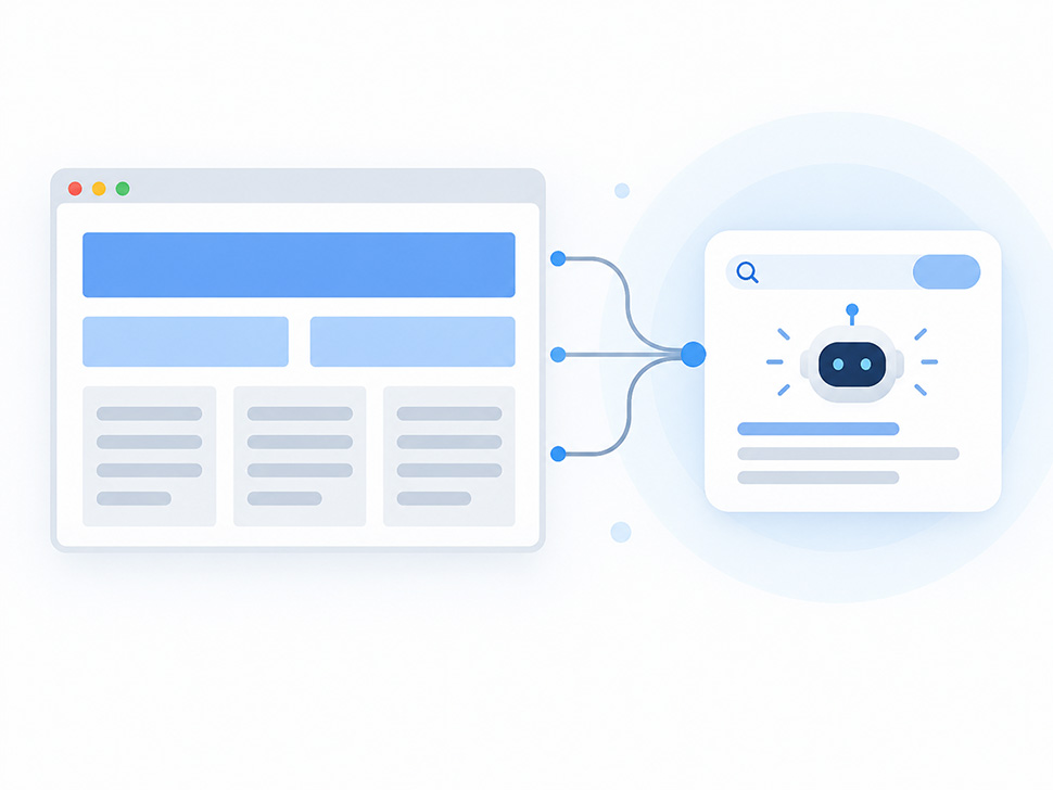
The biggest structural shift heading into 2027 isn’t visual at all — it’s how content gets found. Generative engine optimization (GEO) is the practice of structuring your website so AI tools like ChatGPT, Perplexity, and Google’s AI Overviews can accurately read, summarize, and cite your content when someone asks a related question.
How AI Tools Are Changing the Way Websites Get Found
The tools doing the finding are changing too. AI-powered search assistants are increasingly the first stop before a human ever clicks a link, which means your content needs to hold up under machine reading as well as human reading. That doesn’t mean chasing every tool that promises to “optimize” your site overnight — it means making sure the fundamentals are solid enough that any tool, human or AI, can find and trust what’s there.
This changes web design in a few concrete ways. Content needs clean heading hierarchy (a real H1, logical H2s and H3s, not decorative text styled to look like headings). Pages need to answer specific questions directly rather than burying the answer under three paragraphs of preamble. And structured data — schema markup for services, FAQs, reviews, and business information — matters more than ever, because it’s often what an AI system reads first.
For a local business, this means you can no longer treat your website design as a static brochure. It has to be built so that both search engines and AI answer engines can parse it correctly. That’s a technical requirement now, not a nice-to-have.
Personalization Without the Creepiness
Personalization has been a buzzword for years, but 2027 is when it becomes genuinely accessible to small and midsize businesses rather than just enterprise retailers with massive data teams. Modern content management systems can now show returning visitors different messaging, surface location-relevant service pages automatically, or adjust calls to action based on what a visitor has already viewed.
Smarter Interfaces Without Crossing the Privacy Line
Done well, this reduces friction. A visitor from Boulder sees Boulder-relevant proof points; a visitor who’s already read your pricing page sees a scheduling prompt instead of another explainer. Done poorly, it feels invasive — overly specific retargeting, pop-ups that reference browsing behavior too explicitly, or personalization that slows the page down to deliver marginal relevance gains.
The trend worth adopting is subtle personalization tied to genuine usefulness: dynamic content blocks, location-aware service pages, and smart defaults. The trend worth skipping is anything that makes a first-time visitor feel tracked before they’ve decided to trust you.
Chatbots Are Finally Becoming Useful
Chatbots have had a rough reputation for good reason — most were glorified FAQ menus that frustrated more visitors than they helped. That’s changing. The chatbots showing up on business websites in 2027 are built on language models capable of actually understanding a question, checking real business information, and either answering it or routing the visitor to a human at the right moment.
For a service business, a well-built chatbot can qualify leads after hours, answer pricing and availability questions in real time, and reduce the number of visitors who leave a site simply because they couldn’t find an answer fast enough. The mistake we see businesses make is installing a generic chatbot plugin with no real integration into their services, hours, or booking system — which just recreates the old, frustrating experience with a modern interface.
If you’re considering a chatbot, treat it as a real project with real content behind it, not a plugin you activate and forget.
Typography Is Doing More of the Work
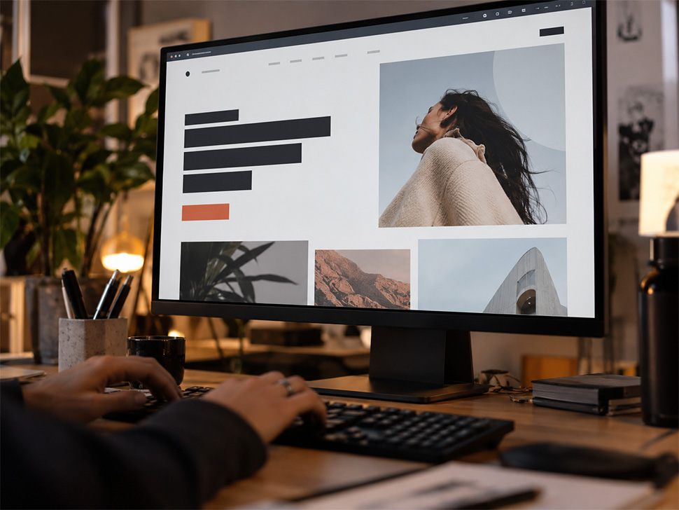
Bold typography has moved from a stylistic choice to a functional one. As more traffic arrives on mobile devices and attention spans shrink, type itself is being used to establish hierarchy, signal importance, and guide the eye — sometimes replacing imagery altogether on above-the-fold sections.
This matters for conversions more than most business owners realize. A homepage headline in confident, well-sized type communicates authority faster than a stock photo ever will. It also loads faster, renders consistently across devices, and doesn’t require the compression tradeoffs that slow down image-heavy pages. Expect to see more sites in 2027 leaning on strong typographic statements paired with generous white space rather than crowding the page with visuals that don’t add information. These are the kind of bold type choices that get tested in Figma long before a single line of code gets written.
Minimalism, Cognitive Load, and Why Less Actually Converts More
Minimalist web design keeps getting rediscovered because it solves a real problem: cognitive load. Every extra element on a page — another banner, another animation, another competing call to action — asks something of a visitor’s attention. Attention is finite, and every unnecessary ask reduces the odds they complete the one action that actually matters to your business.
The businesses that get this right in 2027 aren’t stripping their sites bare for the sake of trend-chasing minimalism. They’re being deliberate: one clear value proposition per section, one primary call to action per page, layouts that give content room to breathe instead of competing for space. This isn’t about a site looking “clean” for its own sake — it’s about making the path to a phone call, a form submission, or a booking as frictionless as possible.
If your current site feels busy, that’s usually not a design preference problem. It’s a conversion problem. That’s what modern web design looks like when it’s done right: less about chasing styles, more about solving the problem in front of you.
Layouts, Spatial UI, and Where Scrollytelling Actually Belongs
A few layout trends are worth knowing about, with very different verdicts on whether they belong on a local business site.
Spatial UI — interfaces that use depth, layering, and subtle 3D elements to organize information — is gaining traction on larger platforms and product sites where visual differentiation matters. For most local service businesses, it’s overkill. It adds development complexity and load time for a stylistic benefit that rarely moves the needle on lead generation.
Parallax scrolling, where background and foreground elements move at different speeds, had its moment several years ago and still shows up in portfolios. Used sparingly — a single hero section, for instance — it can add polish. Used throughout a site, it slows performance and often confuses navigation, particularly on mobile.
Scrollytelling — long-form pages that reveal content, animations, or data as the visitor scrolls — works well for storytelling-heavy content like an “about us” narrative, a case study, or a process explanation. It’s a poor fit for a service page, where visitors want information fast, not a guided experience.
The pattern across all three: layout trends that add depth or motion belong in specific, limited contexts. Applied broadly across a custom WordPress website, they tend to hurt performance and clarity more than they help.
Color Palettes and the Return of Boldness
Color trends move faster than almost anything else in design, and 2027 is seeing a shift away from the muted, safe pastels that dominated for years toward higher-contrast, more confident palettes. This isn’t purely aesthetic — bolder color choices also tend to improve accessibility when done correctly, since higher contrast benefits visitors with visual impairments and makes calls to action genuinely stand out rather than blending into the page.
The practical takeaway for a business owner: your color palette should be distinct enough that a visitor could recognize your brand from a screenshot with the logo removed, and your primary call-to-action color should have enough contrast that it’s never a guessing game where to click next.
Animations: Small Doses, Real Purpose
Animation in 2027 web design is trending toward restraint — small, purposeful motion (a button that responds to a hover, a section that fades in as it enters view) rather than the heavier, decorative animation of a few years ago. This shift is driven partly by performance concerns and partly by accessibility, since excessive motion can be genuinely uncomfortable or disorienting for some visitors.
Used well, animation confirms that an interaction worked — a form submitted, an item added, a menu opened. Used poorly, it becomes a performance tax that slows your site down for a visual flourish nobody asked for. If an animation doesn’t communicate something useful, it’s worth cutting.
Micro-Interactions and the Details That Shape User Experience

Not every trend worth adopting shows up as a full redesign. Micro-interactions — a button that shifts color on hover, a form field that confirms an entry instantly, a subtle loading indicator — do more for user experience than most business owners give them credit for. They’re the difference between a site that feels responsive and one that feels like it’s ignoring you.
These are also some of the easiest improvements to test before committing development time. We mock up micro-interactions in Figma alongside the rest of the layout, so a client can see how a hover state or confirmation animation will feel before it’s built — a small investment that pays off in how trustworthy your web experiences feel, without touching your existing content or navigation.
Gamification: Powerful for Some Businesses, Irrelevant for Others
Gamification — progress bars, quizzes, interactive calculators, reward mechanics — genuinely increases engagement for the right business model. A quiz that helps a visitor figure out which service tier fits their needs, or a calculator that estimates project cost, can be a legitimate lead-generation tool.
For most local service businesses, though, gamification isn’t the priority. A well-structured service page with clear pricing signals, real testimonials, and an obvious next step will outperform a gamified experience that took three times as long to build. This is a trend worth evaluating case by case rather than adopting by default.
Sustainable Web Design Is Becoming a Real Consideration
Sustainable web design — building sites that load efficiently, use less server energy, and avoid bloated code — is gaining attention for environmental reasons, but the more immediate business case is performance. A lighter, more efficiently built site loads faster, which improves both user experience and search rankings, since page speed remains a meaningful ranking factor.
In practice, this means fewer unnecessary scripts, optimized images, efficient hosting, and code that isn’t padded with unused plugins and frameworks. It’s a trend that happens to align environmental responsibility with better business outcomes, which is part of why it’s gaining real adoption rather than staying a niche concern.
Responsive Design Isn’t a Trend Anymore — It’s the Floor
It’s worth saying plainly: responsive design isn’t a 2027 trend. It’s been table stakes for over a decade, and if a business’s site still isn’t fully responsive — genuinely mobile-friendly design across phones, tablets, and desktops — that’s not a design gap, it’s a liability. More than half of most local businesses’ traffic arrives on mobile devices, and a site that doesn’t adapt cleanly to a phone screen is actively costing leads every single day it stays that way.
Responsive Website Design Is Now the Baseline
We mention it here only because it’s still, unbelievably, an issue we find during audits of older sites. If nothing else in this article applies to your business yet, this one does.
Will AI Replace Web Designers?
No — and the businesses that assume otherwise tend to learn the difference the expensive way. AI tools are genuinely useful for speeding up specific tasks: generating layout drafts, writing initial copy, producing image variations, or handling repetitive coding tasks. What AI tools don’t do is understand your business, your customers, your competitive position, or why a particular layout choice will or won’t convert for your specific audience.
Professional web design in 2027 increasingly means directing AI tools skillfully rather than avoiding them, combined with the strategic judgment to know when a trend fits a business and when it doesn’t. That judgment — informed by watching real campaigns succeed and fail over years, not just running a prompt or accepting whatever a Figma AI plugin suggests — is exactly what AI can’t replicate. There’s a real future for web designers who use these tools well. There’s a much shakier future of web design for businesses that try to skip the designer and let AI make strategic decisions it isn’t equipped to make.
What This Means for Denver Businesses
Not every trend on this list deserves a place in your redesign budget. If we were prioritizing for a Denver business right now, generative engine optimization, disciplined minimalism, and genuinely responsive performance would top the list — they affect whether customers find your service pages at all. Bold typography, thoughtful color, and restrained animation would come next, because they affect whether visitors trust you once they arrive. Gamification, spatial UI, and heavy scrollytelling would be case-by-case, worth considering only if they serve a specific business goal rather than a design preference.
Which Web Design Trends Are Actually Worth Your Budget?
Not every design trend deserves a line item in your budget. The ones worth paying for are the ones that improve how quickly people understand your business, move through your site, and take the next step.
For most businesses, that means investing in speed, responsive design, clear navigation, accessibility, strong content hierarchy, and thoughtful use of personalization or animation. Those improvements can make a site easier to use and more effective without making it feel overdesigned.
Trends like 3D effects, elaborate motion, immersive interfaces, or experimental layouts can be useful in the right context, but they should solve a real problem. If a design choice does not improve usability, credibility, engagement, or conversion potential, it is probably not where your budget should go.
Businesses across the Denver metro — from Aurora to Lakewood, Thornton to Arvada, Westminster to Centennial, Littleton to the broader Front Range — are all competing in local search results where these fundamentals increasingly decide who shows up and who doesn’t. A trend-chasing redesign that ignores search intent and page performance will lose to a disciplined, well-structured site every time, regardless of how many 2027 trends it checks off.
If your site hasn’t been evaluated against these shifts, that’s worth doing before your next redesign cycle, and pairing it with an ongoing Denver SEO company strategy is how you stay ahead of that shift instead of chasing it. We track website design trends every year so our clients don’t have to, and we write about the highlights on our blog.
Frequently Asked Questions (FAQs)
What are the biggest web design trends for 2027?
The most significant shifts are structural rather than purely visual: generative engine optimization for AI-driven search, disciplined minimalism to reduce cognitive load, subtle personalization, and genuinely responsive performance. Visual trends like bold typography and restrained animation matter, but they support these deeper shifts rather than replacing them.
Is web design still in demand in 2027?
Yes. The gap between professionally built sites and template-based sites has grown more visible, not less, as both visitor expectations and AI search tools demand cleaner structure, faster performance, and clearer content.
Is there a future for professional web designers?
Yes, particularly for designers who combine strategic judgment with fluency in AI-assisted tools. The technical execution of web design is becoming faster with AI assistance; the strategic decisions about what to build and why remain a human skill.
Will AI replace web designers?
No. AI tools speed up specific tasks like drafting layouts or generating copy variations, but they don’t understand a business’s customers, competitive position, or conversion strategy well enough to replace the judgment a professional designer brings.